VTEX inStore

VTEX is the leading commerce platform in Latin America and one of the biggest in the world. I work as a product designer at VTEX inStore, a brick & mortar store solution – the physical part of the omnichannel strategy for VTEX clients. It is a toolbelt app for the salespeople, allowing them to close sales even with no available stock, shipping for a delivery or picking up in different stores. With a fully integrated system, inStore uses catalog, prices, and promotions from the e-commerce solution, simplifying the operation. In the same way, the salespeople can access customers' data to offer custom services, exclusive promotions, and even recover lost carts.
Since 2019, we've been improving inStore focused on stores from the fashion industry – stores with limited physical inventory. We did it from a partnership with two of the main VTEX clients in Brazil, Grupo Soma and C&A. With them as sponsors, we've been working on it, testing and validating the improvements directly with their salespeople and executives.
The inventory challenge
Even with inStore automatically selecting from a specific inventory (from the current store, from a warehouse, or from other stores) according to its availability, it wasn't clear for the salespeople, especially when the customers asked them about it.
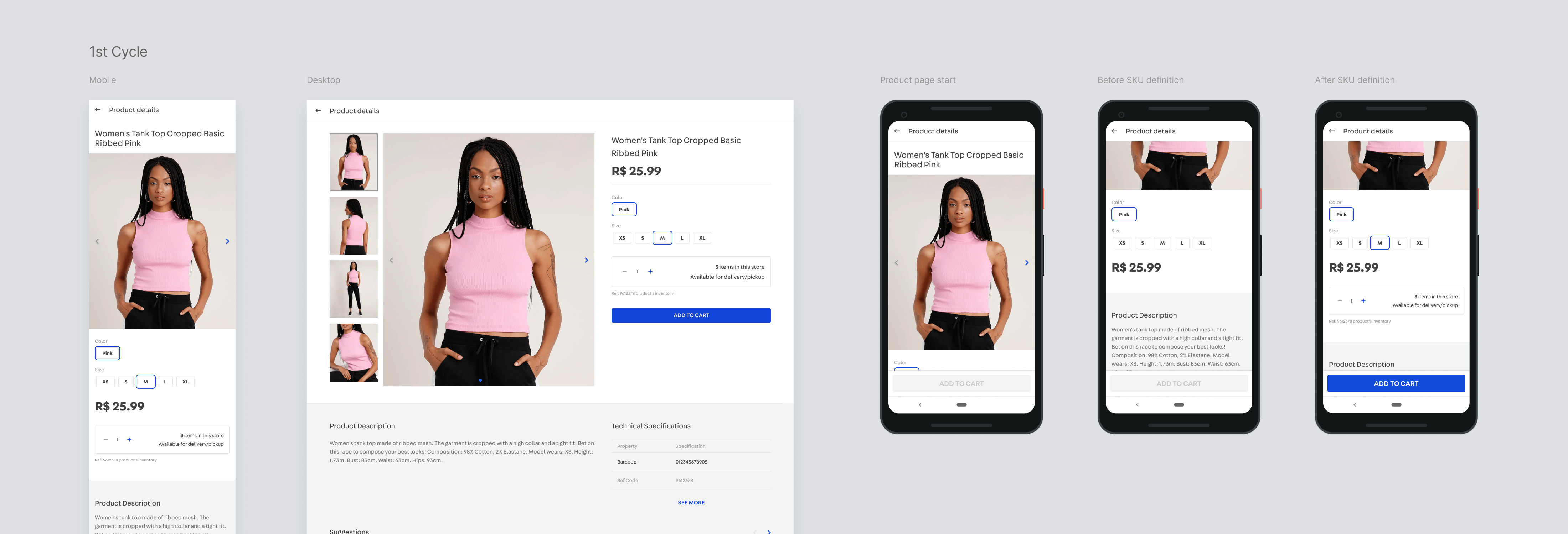
From that point, we just had the inventory numbers from the current store to show. I worked with one of our developers to check what kind of information the VTEX Logistics API could deliver to inStore. We discovered that, by sending the location reference and the desired quantity, the API returned the product's positive or negative availability for delivery or pickup points near there. So I designed an availability box for the product page, involving the numeric stepper. With a simple prototype, we validated it with some salespeople and, after that, we tested a Beta version in two stores.
Uncovering a problem
That new feature was approved by salespeople, but it allowed us to be acknowledged about an unobserved experience problem: the products availability could vary during the selling journey when the delivery address was changed after the products were added to cart.
To understand more about the problem, we checked on our tracking tool to investigate unfinished orders with unavailability warnings, and we interviewed some salespeople that experienced that problem. With that information, I reviewed our checkout flow and did some benchmark on e-commerce players, considering a new approach to deal with the address input. At that moment, the flow asked for/checked the customer's address after the cart overview, which generated availability conflicts and forced salespeople to go back and remove products from the cart.
A deeper exploration
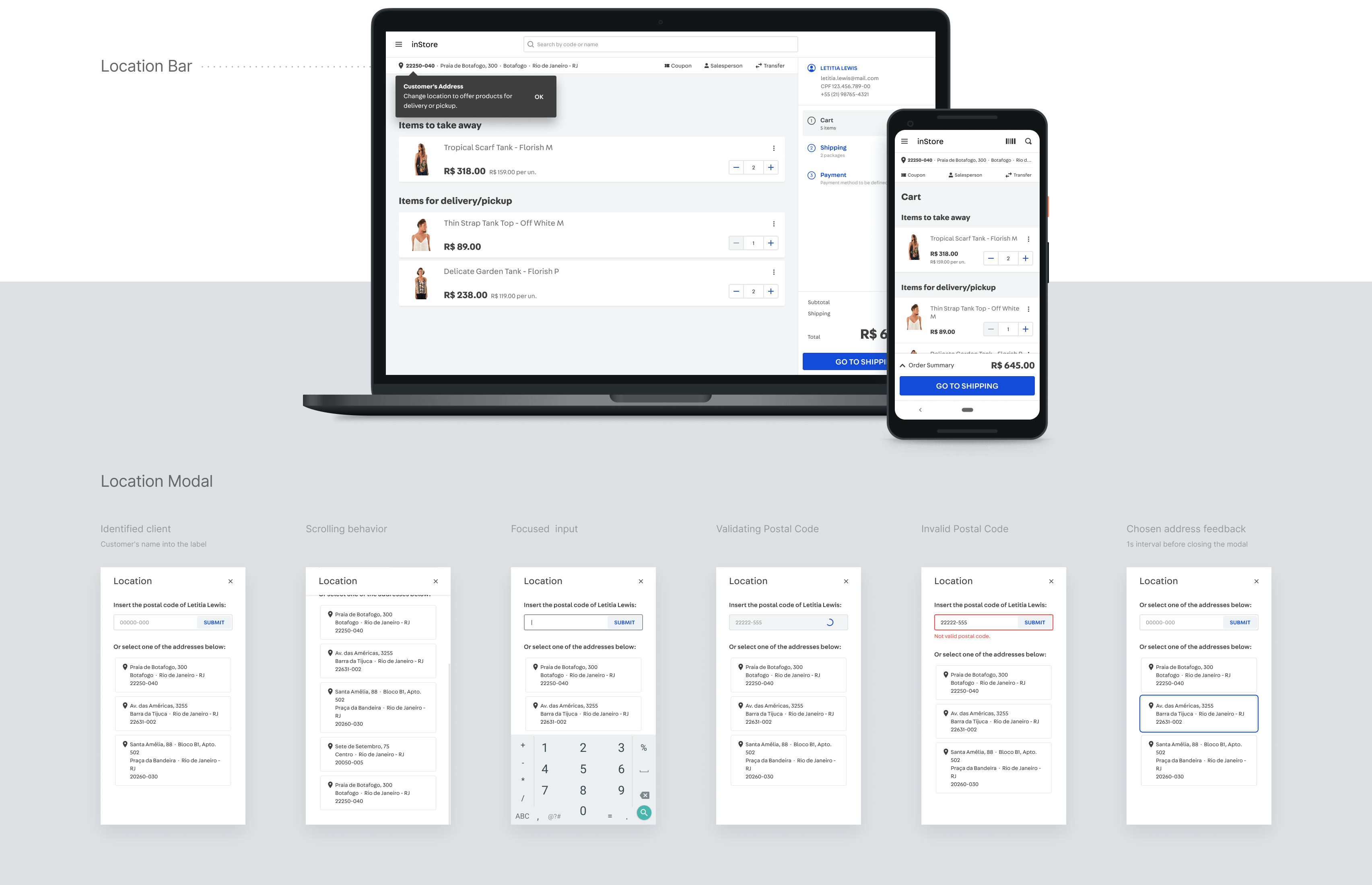
The location is one of the basic references sent to the Logistics API to validate a product availability. As it is information that impacts the availability, I proposed to build a component to input and change the address, present in different moments of the selling journey, from the beginning until the shipping method step, when the location reference is defined at last. From the interviews with the salespeople, I identified three moments when this component would be more relevant: in the cart – as the sale overview –, in the product search flow, and in the product pages.
Considering the access needs of the salesperson in different moments of the sale, I proposed this component as a location bar, always displaying the address reference (the default reference is the address of the current store), and allowing changing the address through a modal dialog, where the salesperson could insert a postal code or just click on one of the customer's previous addresses. As the modal dialog I designed was more complete than the available one at VTEX design system, the team and I documented and contributed evolving the modal component, providing it to the other products.
The location bar appeared in the same place in the product search flow, allowing the salesperson to exchange the store location for the customer address and visualize different inventory availability for the products.
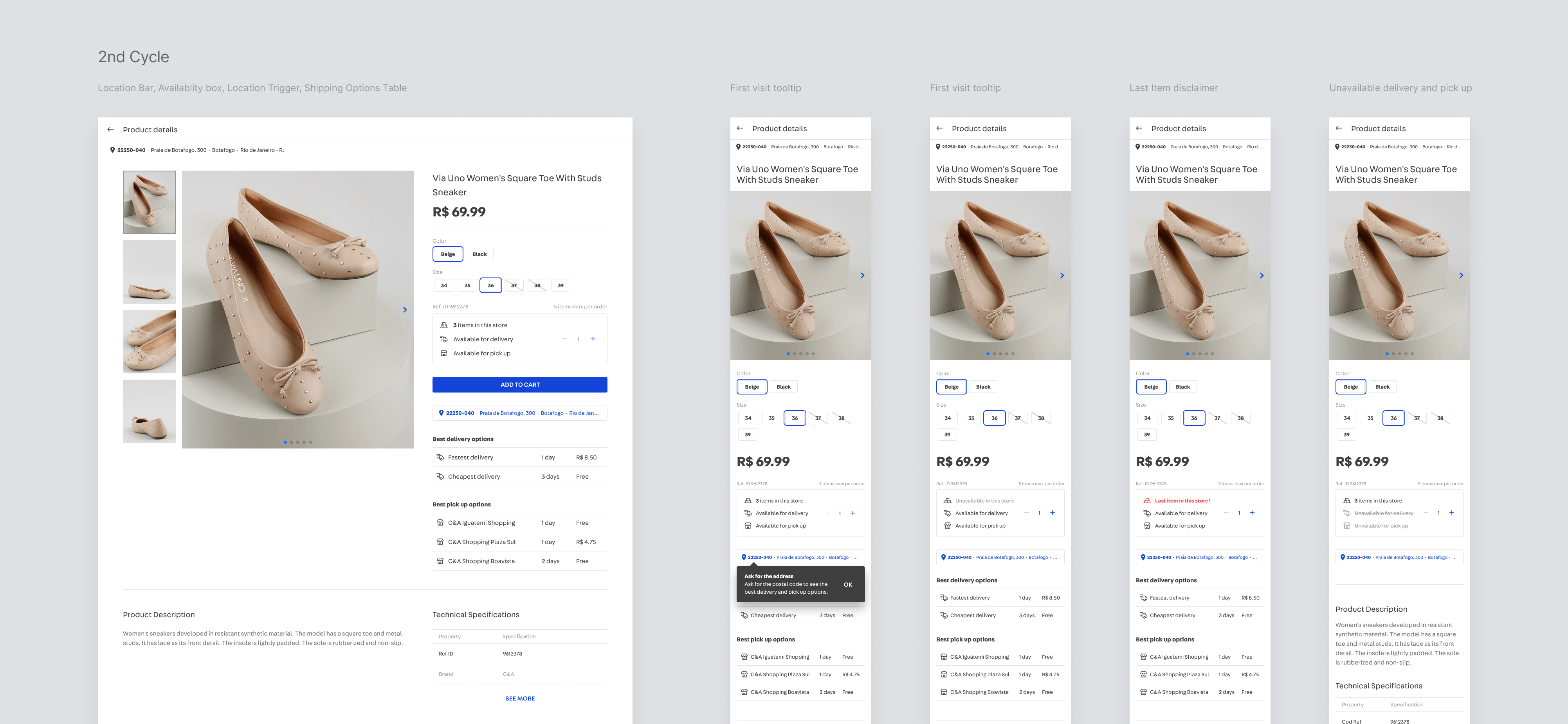
There were other improvements on the product page. Combining what we learned in the interviews and detailing the information received from that API, I revisited the availability box, which now also included the identification of available stock for home delivery and for picking up from other stores, information defined from the location reference plus the desired units of a product. We could highlight the last units' availability, new information to improve the sales pitch. Right below to this new availability box, I inserted a trigger with the location reference, reinforcing the chance to exchange the address and have more sales options.
Since that API also returns the best delivery options (the fastest and the cheapest delivery options, in addition to the stores with the best pickup conditions), I designed a table with the best options for the desired product, considering its SKU, the number of units, and the location reference. As soon as the salesperson had this information chosen, the page showed a table with the best delivery options, providing another way to reinforce the sales pitch: even the items not available in the current store could be offered from great delivery and pickup point options. For brands with specific charging types, we made the freight costs presentation on the table optional.
A global setback
After validating with the sponsors and some salespeople, we implemented this second cycle and provided it in Beta for some stores. Sadly, we could follow those new features usage for just a few weeks, as stores closed due to the COVID-19 pandemic. Despite this, we had satisfactory results, accompanied by great feedback from sponsors.
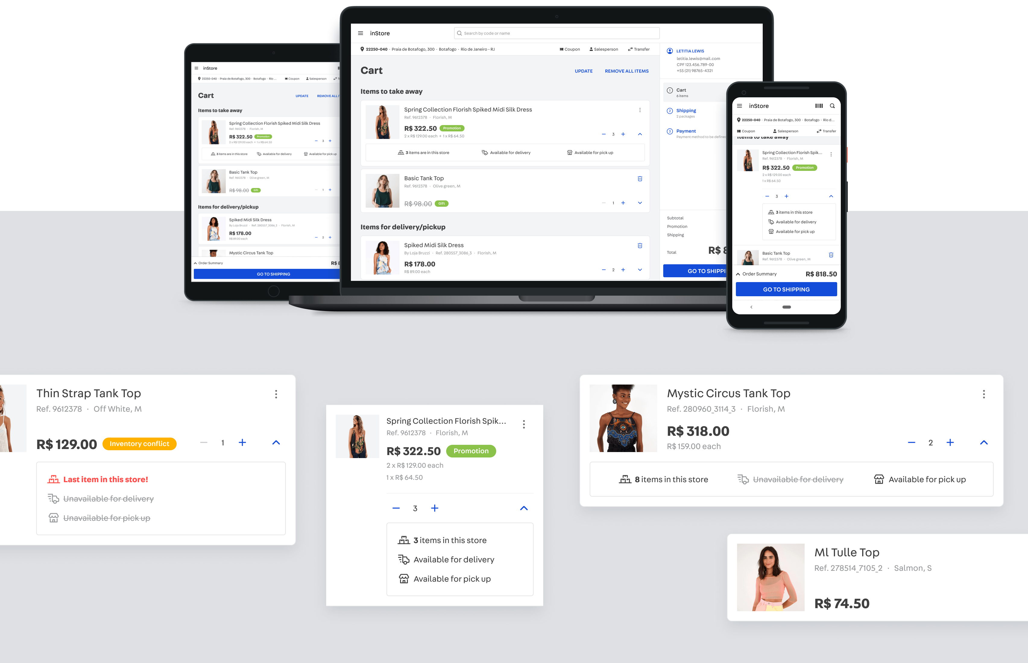
With this pause in using inStore, the team prioritized tackling some technical debts and, due to the positive feedback, we took advantage of that period to extend the solution to other instances. As the cart was the main target for refactoring, I proposed that cart revision included the improvements from the product page to its product cards. I redesigned those cards considering two releases. The first one focused on reorganizing the information (splitting title from SKU definitions, unit prices detailing, and tags for promotions, gifts, and other statuses). In the second release, I brought the availability box into the product card. Thus, any doubt related to the product stock could be checked in the cart too, with no need to return to the product page.
During the pandemic, over the course of a few months, the sponsors proceeded with a gradual process of reopening the stores, considering different stages of isolation throughout the whole country. Therefore, we could validate the usage of inStore last updates gradually, through visits in some stores and weekly meetings with the executives. The main sponsor in this period was C&A, which had far superior results in service and orders due to the implemented improvements. As the results remained positive and constant, the brand felt confident and expanded the usage of inStore as a sales tool for its entire chain nationwide.
Results
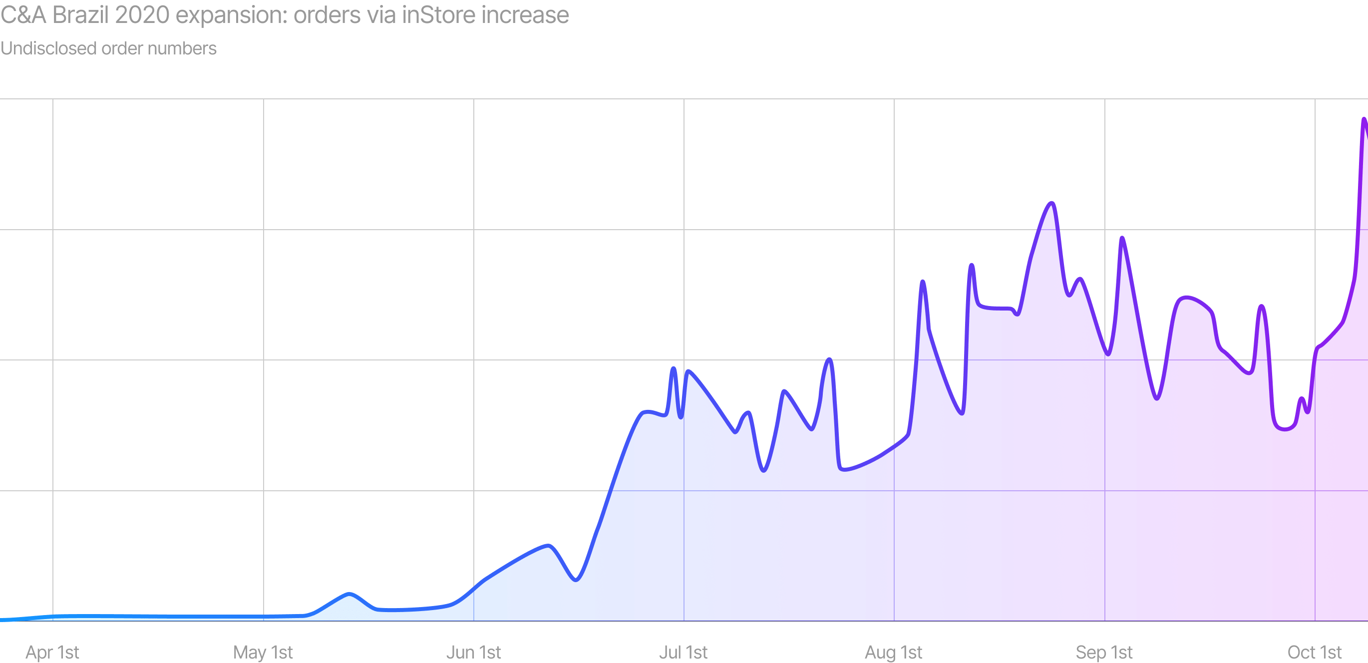
The improvements in VTEX inStore's experience and engineering directly influenced the sponsors' confidence in the tool, enabling the expansion of its use throughout the C&A store network and salespeople training in 125 cities across Brazil. With the expansion, the average of orders via inStore increased by more than 10,000% during the pandemic. Our monitoring continues to be carried out weekly through meetings with sponsors, visits to stores and NPS surveys with salespeople. All this information, added to the inStore quantitative data, has been helping to prioritize the product backlog.
