Backstage StyleGuide

Globo.com was building a new CMS called “Backstage” and it required a new interface which addressed the technical needs (easy to use by developers) and usage needs (solving the editor's current issues).
We did research with developers and stakeholders to understand the challenges of who is producing new CMS solutions, and with editors to learn about their day-to-day problems with the old CMS.
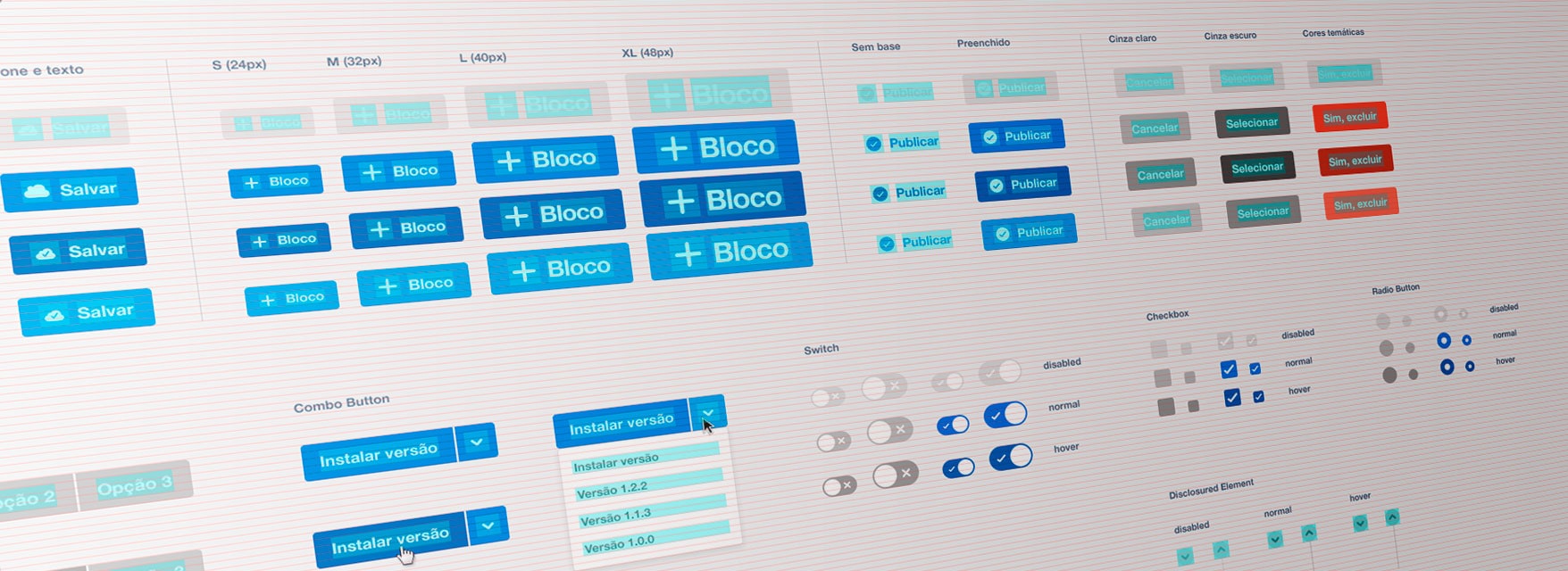
In order to facilitate its implementation, I designed a fully componentized interface framework based on the atomic design concept. Basic elements were built aligned on a baseline grid, set up (size, criticalness, etc.) and used as a basis for more complex elements, from labels and buttons to pages and entire flows.
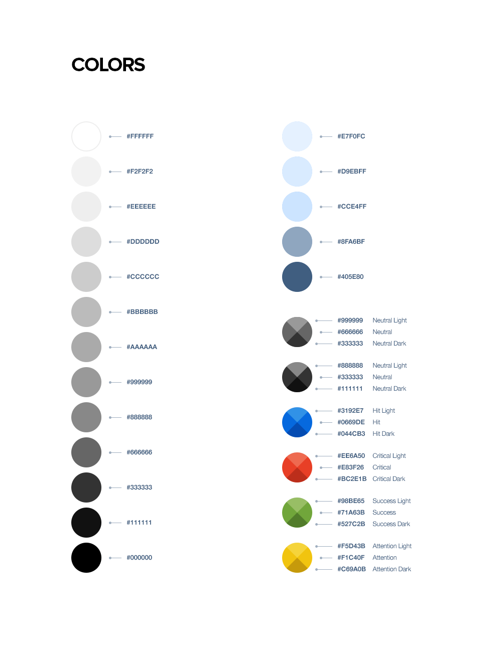
Under the editors' perspective, we noticed the action flows were confusing, plus they suffered from technical performance (heavy pages, a lot of javascript, weak computers, and weak Internet bandwidth). Along with atomic design, I designed the UI framework with as few elements as possible to help the editors' cognition. The minimum of boxes, separators, colors, without shadows, gradients and font-face.
The project was planned to have a mobile editing release, and as a result, I designed the style guide and the structure of the pages with a mobile-first approach and 100% responsive.


